Happy Sunday! I don’t know about you, but Sundays are my favourite day of the week. It feels like the natural time to switch off, give yourself permission to be lazy and take stock of the week gone by.
This week I made a big decision, to introduce some colour into my work! Looking at my prints, you wouldn’t think I love colour as much as I do. My linocuts are all about the textures and contrast you can achieve with simple black ink. I pour so much detail into my prints that somewhere in my mind I chose to stick to black and white prints because I was worried that adding colour would somehow clutter the design.
However, my pattern design journey has led me to the inescapable conclusion that I love colour and I’m going to jolly well use it!
We have a spare room downstairs in our house that used to be my studio space and now serves as a playroom, spare bedroom and general holding pen for things I need to sort through. In an attempt to make it a more purposeful space in our home, I turned to Pinterest to look for some decor inspiration. I adore wallpaper and began pinning ideas with fervour until I had too many to choose from and no clarity at all on what I wanted the room to look like.
One problem I seem to encounter when choosing a wallpaper is finding something that complements our modest croft house - I love a decadent Chinoiserie as much as the next person but it just wouldn’t sit right in our wee house. I want a pattern with playful motifs but also something that references nature and the kinds of plants and animals my son and I might see around our village.
Can you guess what’s coming?
That’s right, I’ve decided to design my own!
I have always loved the Arts and Crafts period of wallpaper design and the Apothecary’s Garden (a design by C.F.A Voysey) is one that I always come back to for inspiration. It’s so charming in its simplicity. The pattern is laid out as a patchwork of natural motifs. It’s playful, colourful and the perfect inspiration for what I want in our playroom. I have been working on a collection of loch-inspired prints recently so my two projects have coincided seamlessly.
Although I haven’t finished this pattern yet, I have outlined my process here so you can see how it’s going so far:


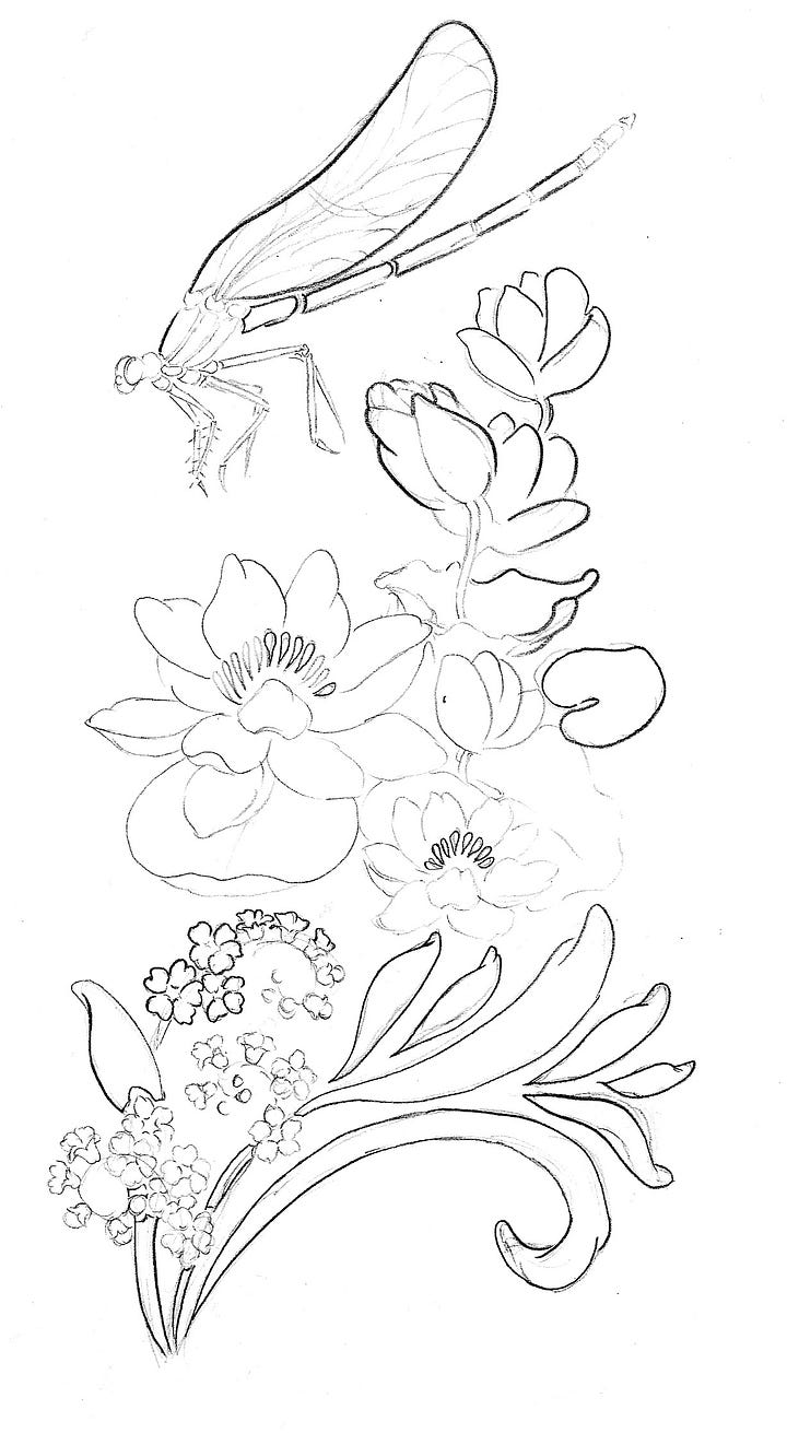
I started my design by sketching out a batch of drawings and fitting them together into a pattern a bit like using tiles (the pattern is a half-drop repeat).
I then drew the images in more detail separating them into three blocks of three images which will make up the repeat.
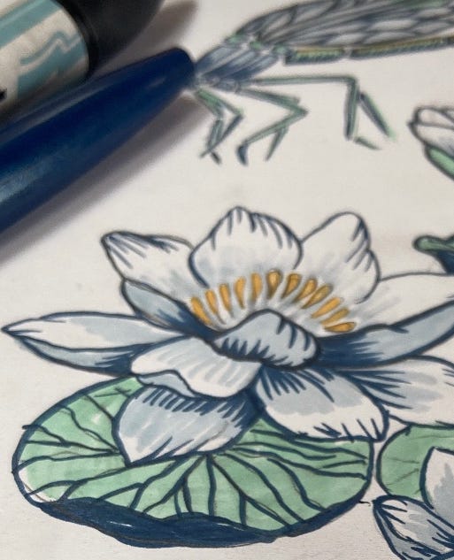
To wrap my mind around the best way to separate the colour layers I coloured in my drawings using marker pens.
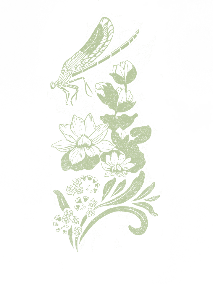
Then I began the reduction linocut. This involves carving away the lightest area in your image first eg. white, printing it and then carving the next lightest area, printing it etc etc.
The twist here is that I am printing each reduction layer in black! Wait, what? I know, back to black, but it will end up in colour I promise. Once you have printed each layer of a reduction print - the result is FINAL. You can’t go back and change it so I am going to recolour the prints digitally. This gives me the freedom to explore different colourways and refine my colour choices later on. I haven’t done this before but I am confident(ish) that it’s a great idea. I could have carved each colour layer separately of course but I honestly just feel like it’s a waste of lino when I can achieve the same result on my computer.
I can’t wait to share the finished design with you soon.
Let me know what you think:
Until next week,


Looking forward to seeing how it progresses 😘